
In the early years of driving, it was a discombobulating mess. Streetcars shared the road with horses, cars, people. A form of traffic control was needed.
 One solution was offered by William Phelps Eno, a wealthy New England native, who conceived the stop sign in a 1900 article for Rider and Driver magazine titled “Reforming Our Street Traffic Urgently Needed.” According to the New York Times, Eno—whose name lives on in the form of the transit-oriented group Eno Center for Transportation—suggested placing stop signs at intersections.
ut his advice wasn’t heeded until the following decade. The first stop sign was erected in Detroit, and though some accounts pin the historical moment to 1915, a story from the Detroit Free Press says it went up a year prior, at the corner of Cass and Clifford avenues. At the time, not everyone in town liked the idea.
“A silly waste of money,” one councilman said at the time, according to the 1954 Detroit Free Press account. “No driver is going to stop at a corner if there isn’t a policeman right there to halt them.” 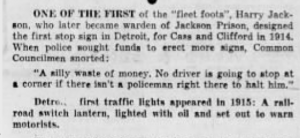
Shape
Detroit’s first stop sign is oftentimes described as a 2′ by 2′ white square with black lettering. Unfortunately, I couldn’t track down an image of it, but the photo here was taken in 1915 at the corner of Woodward and Jefferson.
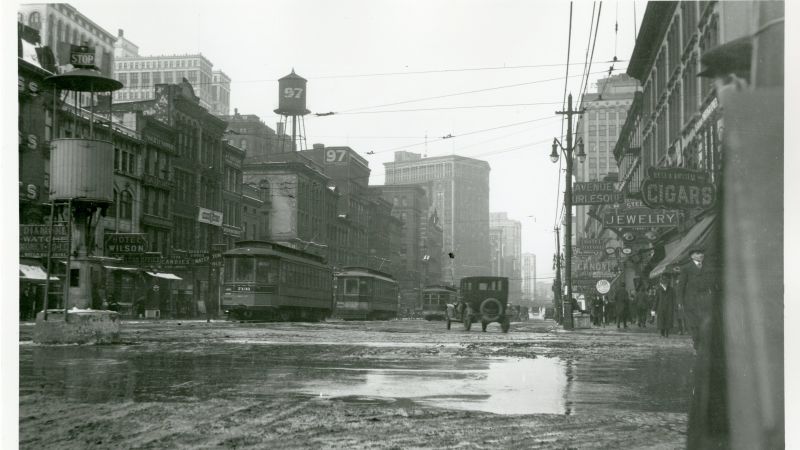
At the very least, it offers a glimpse of the first stop signs that were initially rolled out. Toward the left of the image, you’ll see the letters STOP situated above a crow’s nest-style traffic stand. It’s a far cry from the ubiquitous red octagons of today.
When it comes to the shape, the U.S. Department of Transportation’s Federal Highway Administration points to the Mississippi Valley Association of State Highway Departments. In January 1923, according to the FHA, the association convened a meeting in Chicago, where it adopted a plan to establish more uniform signage:
- Round: warnings at railroad crossings.
- Octagonal: STOP
- Diamond shaped: “slow” warnings”
- Square: caution or “attention” messages
- Rectangular: directional and regulatory information
The following year, the inaugural National Conference on Street and Highway Safety was held. A lengthy report with a litany of recommendations followed, including a sub-section on sign colors. As far as I can tell, the 1924 report marks the earliest date when red is recommended as an appropriate choice for STOP.
Color
But early on, most stop signs were yellow. In the 1930s, a committee of traffic engineers formed the Joint Committee on Uniform Traffic Control Devices, with the intent of producing a standard manual for street designs that could be replicated everywhere.
By 1935, the group produced the first Manual on Uniform Traffic Control Devices, a bluebook of sorts that has been updated and remains relevant to the present day. The inaugural edition called for regulatory signs to be black on white rectangles, except for stop signs, which would be shaped like octagons with black lettering on a yellow background, or yellow lettering on black.
Yellow seems like it’d achieve the same effect of catching someone’s attention. But the intention all along—as it was recommended by 1924 National Conference on Street and Highway Safety—was to eventually go red. The problem?
But Why Red?
Evidence suggests the signal colors were borrowed from the railroads, where red meant “stop,” green meant “caution,” and clear (white) meant “go.” These came into use in the 1830s and 40s. Around 1914, a broken red lens caused a locomotive engineer to mistake this for a clear “go” and smash into an oncoming train with disasterous results (another example of Deadly Design). Subsequently, the red/yellow/green signals we use today were adopted; yellow was thought to provide the greatest contrast to the other two colors. Red has been a symbol of danger since the time of the Greeks. The reasons for the use of green have been lost to history.