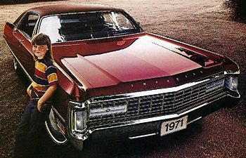
In the 1970s, a family car was as likely to be Red or yellow or green. So, what happened? Why did the vast majority of car buyers shun real colors?

It’s no secret that our nation—no, our world—is currently in crisis. Despite frivolous distractions like this whole “pandemic” and “global economic shutdown”, we all know that the real crisis is the Crisis of Boring Car Colors. I’ve ranted about the tyranny of grays and whites and blacks before—colors the color professionals call “achromatic,” but now I have someone I can directly ask—Paul Czornij, BASF’s North American lead designer. So let’s get to the bottom of this.
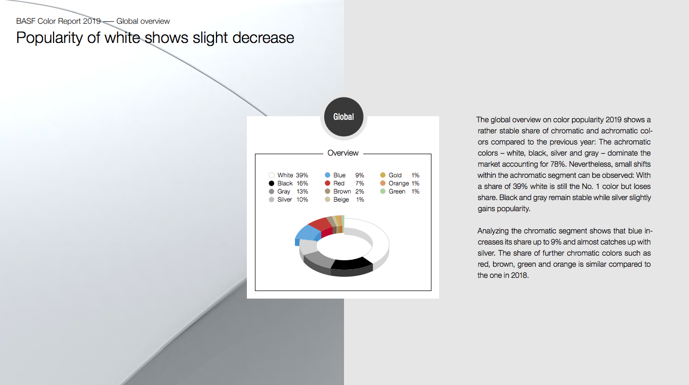
Back in January, before everything went to shit and the world could think about car colors, BASF released its 2019 Color Popularity Report.

The report made real what you’ve likely suspected: non-colors dominate. A staggering 78 percent of cars globally are white, black, silver, or gray, with white dominant at 39 percent.
Blue made a bit of headway, up to nine percent, so that’s something.
Regionally, it’s interesting as well; Asia is nearly half white, but they seem to have a greater spectrum of chromatic colors, too. Here in America, it’s overwhelmingly achromatic, but red and blue have decent sized chunks.
Color selection is interesting and, like so many things automotive, not remotely rational when it comes down to it. I asked Czornij some of the car-color questions I suspect we’re all thinking, and while he gives some very compelling, well-considered answers, let’s not fool ourselves about where he’s coming from.
Paul works for BASF, and as such is in the pocket of Big Pigment, so if achromatic are selling, he’s not going to badmouth them.
Also in the interest of full disclosure, I should be clear these questions were sent and answered before the pandemic, and BASF wants everyone to be very aware that they fully understand the gravity of it all, and they do not want to seem uncaring.
That’s fair. I don’t think anyone will fault BASF for engaging us in some talk about car color, since we’re all shut in and could use new distracting things to think about, anyway.
So, just to be clear, BASF was focusing on important COVID-19-related things and not just pissing away time talking about car paint.
Jason Torchinsky: First off: why did automotive colors get so boring?
In, say, the 1970s, a family car was as likely to be orange or yellow or green as any other color, and that continued into the 1980s, though I feel like the 1980s were the era that birthed the metallic silvers and grays that would come to dominate car colors in later decades.
So, what happened? Why did the vast majority of car buyers shun real colors? Today, the holdouts for bold, actual colors are in the low end of the market—Mitsubishi Mirages, Fiat 500s, etc—or the high end—Lamborghinis, Ferraris, Porsche, along with specialty sporting cars like GTis or WRXes and so on. Essentially, people either too poor to give a shit about status or too rich to give a shit.
What’s going on? Is it all perceived status-related?
With that out of the way, here’s the Q&A from paint people!
Paul Czornij: There’s quite a bit to unpack here. It’s correct to say that colors in the 70s and 80s were more hue focused, with blues and reds being popular. But some important changes to paint technology opened up the styling possibilities that previously were quite limited. The 80s saw a strong upward shift to using flaked pigments, which did a couple of things. First, these flakes brought the concept of texture into car color, making coarse or fine-looking colors created a dimensional look to a car, enabling the shape of the car, along with its contour lines, to be accented even more. Metallic coatings have the look to make the automobile appear larger and more 3D. Secondly, the pearlescent mica-based flakes intensified a color’s hue, so that richer, more expressive shades could be designed. The red color space, for example, particularly benefitted from this technological bump.
But the advances in pigment and coating technology didn’t stop there. Cars were starting to be painted with a thin clear coating as the finishing touch to the appearance. The clearcoat, as it’s typically called, raised the smoothness and gloss of the coating, which made it possible to put silver and gray colors on cars without looking dull. The color coat also kept getting better at using smoother metallic flakes and having special features to help these flakes align in a more parallel fashion. The result is a crisp look that reflects strongly when you look at it head-on and then drops off to a darker appearance as you move away from the reflection angle. The interplay of light color descending to a dark color works beautifully on a high surface area. It’s almost tailor-made for a car.
And speaking of tailor-made, there was a spike in technological gadgetry that had a broad-reaching impact for many industries. Cars are perceived as hi-tech, so the psychological association of the color of metal surfaces, silver to silver=gray, naturally found a home in the automotive world as silver was seen as the color of technology.
Remember, we are dealing with perceptions, image, psychology, and the like. So, instead of thinking about it as an aversion to ‘real’ colors, it might be more related to more options in the palette of car paints, and what the market deems as appropriate for those cars. In other words, the high-end sports cars you mention are a great fit for the bold racing red shades and the small subcompacts work quite well with playful hues, but SUVs and pickups might have a better look with other color families. Let’s not forget that image plays a role – the pure, clean white can exude eco-friendly overtones.
JT: Is the achromatic trend likely to continue into the foreseeable future? Is there any chance to return to actual colors being popular?
PC: The market ultimately decides – walk into a dealership and view the palette of colors being offered for a car, and you’ll typically find more than just black, white, and gray. BASF puts together its Automotive Color Trends collection, each year showing 65 innovative colors that reflect new directions in societal, technological, artistic, and other influential design areas. The BASF offerings span a gamut of hues, extending beyond achromatic. For reasons mentioned already, color selection is an emotional and complex act that is focused on brand, personal image, an innate sense of what kind of paint simply looks right on the vehicle. Let’s not forget that other, more abstract things add to the mix: the great recession, for example, made the color offerings more muted. It will be interesting to see how the current pandemic will influence how people want to color their cars.
JT: Why was teal so big in the 1990s, and why is it—and almost all greens—gone today?
PC: I’ve heard that it was the connection to the environment – there was not much in the subliminal aspect back then. It was trendy, it spiked in popularity, and then the consumers moved on to the next big thing, like silver. Green is an interesting hue – it can be stretched in many directions, e.g., bluish-green, yellowish-green, light, dark, solid, metallic, pearlescent, so it might be poised for a comeback, maybe not as strong as before, but for certain car body styles.
JT: Yellow is my favorite car color. Please provide me with some evidence to defend my decision.
PC: You want to be noticed. There are plenty of websites and articles on the web that can define what kind of personality you have by your color choice, so you can research that. Yellow was also quite popular decades ago, and have an iconic connection with some cars. It’s a super period color for certain European cars of the 70s. And it works well with some car styles, but not with others.
JT: Do you have a favorite car color? Why?
PC: I would probably have to answer that with: “depends what kind of car”. I can get into a solid bold red on a sports car; a deep jet black on a luxury car; or a matte pearlescent white on a high-end SUV. All cool.
JT: The rise of beige is interesting; how do you think beiges and browns will fare in the future? How are they perceived?
PC: There’s a lot of discussions these days about waste minimization, climate change, and similar topics of stewardship for the planet, so natural-looking colors would show up more frequently. There is also something about the color space that is soothing and stress-relieving. That last aspect may make it more important for future mobility – especially if people get into a car that drives itself, the color can help make the trip more enjoyable.
JT: Do you see a place for two-tones and stripe kits in the mass market again?
PC: Way back in the 20s, two-toning was quite the craze, as the running boards and other car features lent themselves for this kind of expression, and many can remember the days of the two-toning with vinyl roofs. The concept is still effective, but it adds another layer of complexity for assembly plants. If technology can allow for that and not cut into production time and volumes, then it will come back.
Source: https://jalopnik.com/i-asked-a-real-car-color-professional-hard-hitting-ques-1842885985